Case Studies
Marcin Dobas
 |
“I’m convinced that if I hadn’t used such a good monitor, the photographs printed in my book would have turned out completely different and I wouldn’t necessarily be happy with them.” |
Tell us a little bit about the kind of photography you do.
I’m a travel photographer. I specialize in landscape and wildlife photography, although I also enjoy capturing people and the way they interact with the world around them. I love working outdoors, especially when it allows me to observe wild animals in their natural habitat or to visit places untouched by man.
My photos are regularly published in magazines such as National Geographic and National Geographic Traveler. Photo editors pay attention not only to the aesthetic value of the pictures, but also to their quality. Although all the retouching I do is minimal and doesn’t go beyond what is considered ethical in my trade, it is important to remember that good photography is not just a matter of pushing the shutter button at the right time – it’s also about all the subtle nuances that can be achieved during RAW processing.
How important is color management to you?
It’s a very important aspect of photography. In this day and age, the photographer has the means to control each and every step of image creation. The final product doesn’t depend only on the moment you choose to press the shutter button, but also on the way you process the RAW file. Unfortunately, TV, monitor, laptop, and tablet manufacturers try to gain clients by offering them increasingly vivid, saturated colors. It’s hardly surprising, since an average customer who doesn’t have expert knowledge is very likely to decide that a more saturated color display looks better.
For a professional photographer accurate color display is absolutely crucial – especially if the photos are to be printed in a book or magazine, or displayed in a gallery. Working on a calibrated and profiled monitor is therefore essential. I grew up using Fuji Velvia and I often use techniques that increase saturation (like polarizing filters), but the only way you can really ensure color accuracy of printed photos is when you work on a professional graphics monitor.
Where do you find inspiration?
I try to follow photographers whose work and portfolios I admire. I believe it’s a great way of developing your own skills. Another good source of inspiration is television, for instance BBC productions. I also start every day with browsing through my Facebook and Instagram feeds in search of ideas.
When did you choose EIZO, and why?
I decided to invest and change my monitor to EIZO after one of my first commissions for a photography album. Before that, I used to prepare photos for the publishing house by myself, but then I got a call from my photo editor, who categorically asked me to refrain from any retouching. Of course, I didn’t understand why until I saw my photographs displayed on a professional graphics monitor. That’s when I realized how important the monitor used for displaying and editing images really is.
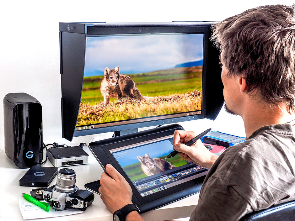
What monitor do you use and what advantages does it give you?
My primary monitor is EIZO ColorEdge CG248-4K. It offers a lot of useful features that make my work easier – wide viewing angles, digital uniformity equalizer technology, automated calibration, and many more. CG248-4K has an ultra high-definition screen, which means it’s four times the size of a full HD screen. However, the first thing you notice is the exceptional pixel size and density, which ensures smooth, detailed images where single pixels are virtually invisible. The monitor itself has a wide color gamut and reproduces 99% of the Adobe RGB color space. While it doesn’t matter much for pictures published on the Internet, it’s invaluable for printed photography. A monitor with wide color gamut allows the photographer to manage colors and see what they will look like if printed in the CMYK color space. This would be impossible to achieve on a monitor that only covers the sRGB color space, as it simply wouldn’t be able to display the target colors obtained in print. Personally, I think it’s one of the biggest benefits of having a monitor with Adobe RGB coverage. It proved indispensable when I started preparing files to be printed in my book. I’m convinced that if I hadn’t used such a good monitor, the photographs printed in my book would have turned out completely different and I wouldn’t necessarily be happy with them.
Another great feature of my CG248-4K is automated calibration. Every time I sit down in front of my monitor I know that all the settings are perfect and don’t need any adjustments. This makes my work much more efficient, since I don’t have to waste time doing manual calibration with external devices.